ShopDreamUp AI ArtDreamUp
Deviation Actions
Early Access
10 Subscribers
For just one dollar a month, You will have early access to all of the upcoming pages of ANY of my works! There's a lot of upcoming projects for those who aren't afraid of spoilers!
$1/month


Suggested Deviants


Suggested Collections


You Might Like…


Featured in Groups

Description
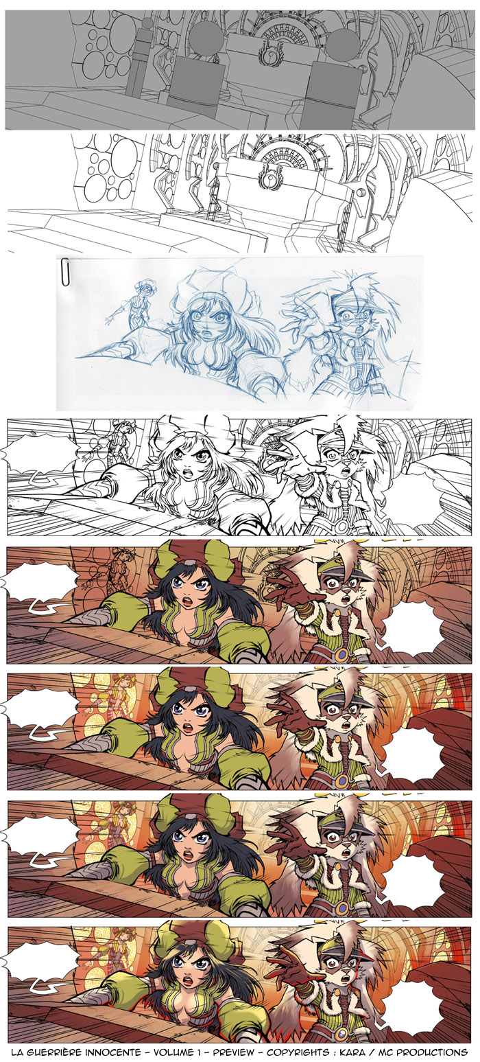
This is a work in progress about a picture from my coming comics : LA GUERRIERE INNOCENTE (The Innocent Female Warrior ^0^)
The making of is originaly in french and you can find it here : [link]
So I m tryng to explain this in english (so please excuse the VERY BAD english ^^)
"In this first image list, we see the introduction of summary dummy models in 3D scenery (and made "toon render"). These will help me to correctly place the characters, and especially to respect their scale relative to one and other but also against the backdrop.
Warning, this type of investment is not the nearest millimeter. Sometimes I cheat to just to balance a composition.
The set is printed with dummu models, so I can draw my characters through. Note that this drawing has three characters, including one in the background. The drawing is scanned and if the two characters in the foreground are placed on a hand slap to the scene, the character of the bottom is placed on another layer to pass behind a "atmospheric fog" when I color the pic.
Similarly, the speed effects are added on a separate layer. Finally, on Photoshop, just for that pic, there are 5 layers in just for the basic black and white step. Resulting in the order:
Layer-1 - Bubble for texts
Layer-2 - speed lines
Layer-3 - characters and lines of the "box"
Layer-4 - Character in the background
Layer-5 - background
Depending on the complexity of some pics, with more complex designs where many more characters in the scenery space, the number of layers can double or triple!"
So now, the colors ^^
"Before even attempting to put my lights, I want to feel the atmosphere of the scene. This is a scene of suspense, with a resonant warning throughout the cockpit. I decided to set up a warm, reddish, but offset by a complementary color welcome in this scene: the green uniforms of the characters.
Initially, the atmosphere was much more reddish, but on the advice of friends, I agreed to make brighter colors and objectively observed that the depth works better in this regard.
For the set, I directly make attack the main grades of light strings. For characters, it is essentially flat colors. Then I put a "fog" between the characters and scenery to better separate them from the bottom. Separating the characters of the set on different layers allows me to create this fog in a few seconds.This is just one of many advantages to working my boards on different layers.
For example, before, when I was draw an explosion in the air expelling tens of debris, I had a tedious job of trimming in order to color all these elements in suspension! Now, I separate the debris from the explosion, and just a few clicks are enough for me to select the same items.
Then I make the shadows and lights of the pic. Again, the shadows are on a separate layer, same for lights. Ditto for the funds of the screens that you see on the walls of the room control. If the characters are mainly composed of colors in solids with some refinements, the decor may receive some texture effects applied directly to the setting colors."
^0^
Image size
700x1547px 467.47 KB
© 2012 - 2024 Karafactory
Comments22
Join the community to add your comment. Already a deviant? Log In
c'est impressionnant le déluge de génie qu'il faut pour sortir une page comme celle-là, félicitations pour ta patience, ton courage et ton talent. Je ne fais pas toujours de commentaire, mais je suis toujours saisi par la qualité de tes images.